Day 42-48: #100daysofmycraftdiary

After 3 weeks of puttering around, Day 42-48 picked up to be productive again though I did hop from project to project this week.

1. Organisation of die cuts

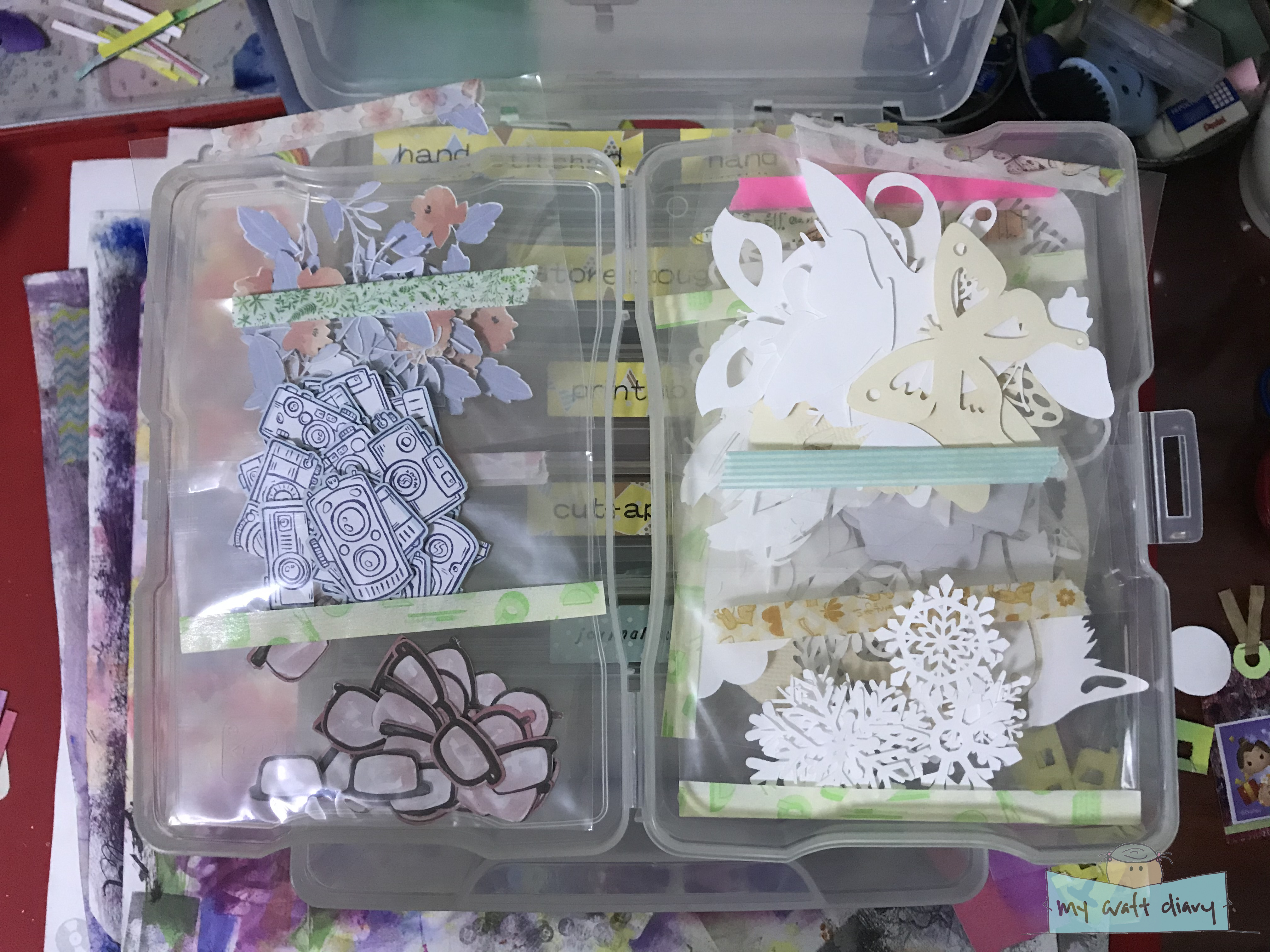
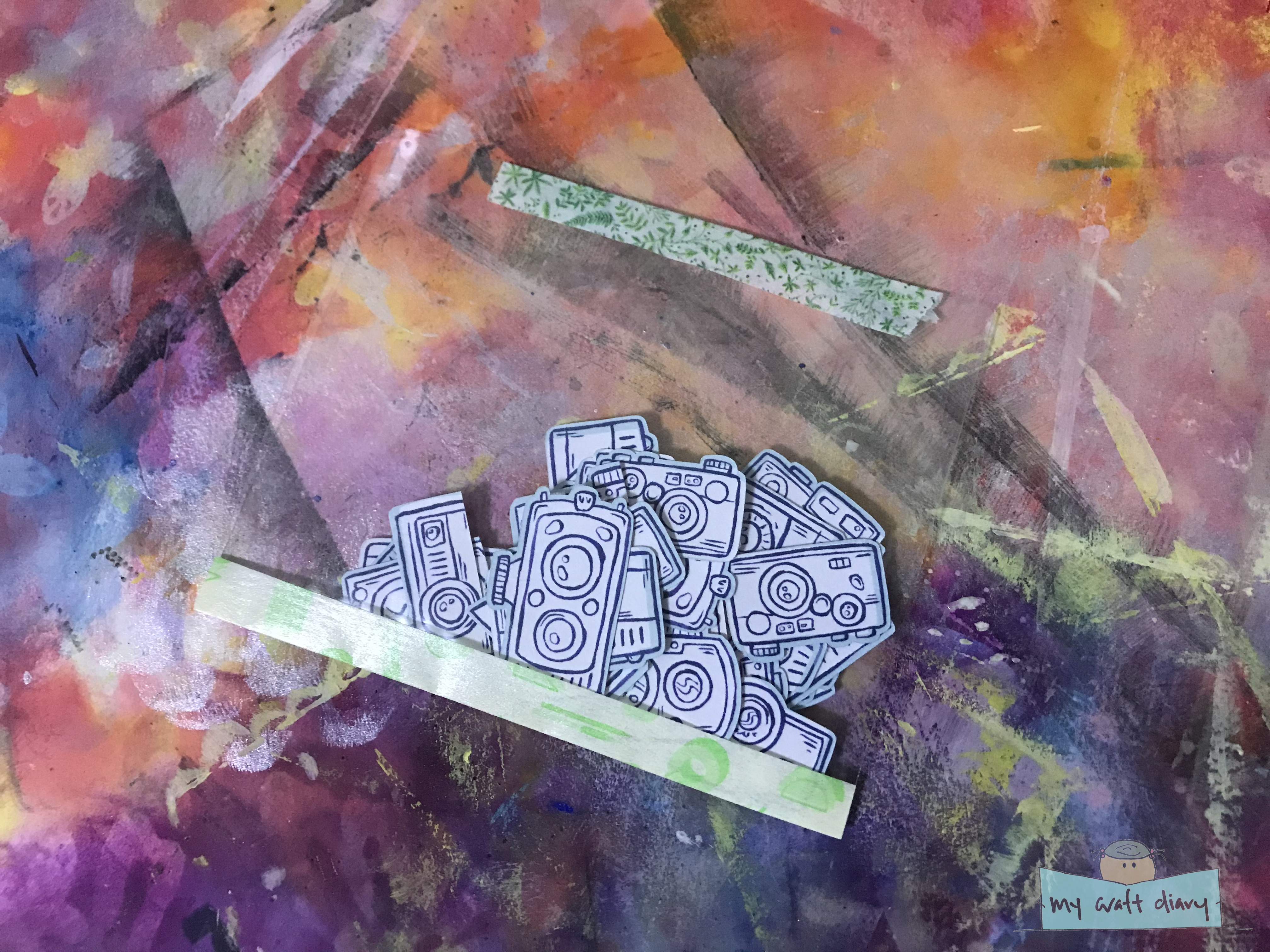
1 & 2. My embellishment box. They are grouped by type so I can find what I need. Each box can be taken out independently.
3. Inside each box, the embellishments are grouped by baggies. This is the die cut box.
4. This is my cut-apart embellishment box.
5. Close up of my little baggies. I used washi tape to seal it up so nothing drops out.

After the PixScan die cutting session the previous, I had a bunch of die cut images and embellishments that I needed to organise and keep so that I can find them easily to use in my projects. Along the same train of thought, I pulled out all the cut apart sheets in my stash and cut all of them up, so I had a lot of cut apart papers and die cuts to organise. The best organisation tip is to store like with like, so I took out my embellishment box and organised its content a little to have a die cut category.

I bought this box from Amazon a while ago, and I love that it has separate boxes inside that can be taken out on their own. They are supposed to be for photo organisation, but I have been using them to store journal cards and embellishments. But having the boxes is not enough, as I have so many different types of embellishments, so I used little plastic baggies to group similar embellishments together. Here you can see that I have them grouped by size, type of image, which paper packs they are from etc.

These plastic baggies are actually what I use to for my clear stamp storage, and I cut them into two to get two shorter baggies. To close them, I used washi tape so they don’t fall out of their baggies and become a mess. The ideal storage baggies would be ziplock bags but I didn’t have small ones on hand and ziplock bags are not as transparent. I quite like how these ones turn out, just by using whatever supply I have on hand.

2. Giving new life to my failed doilies die cuts

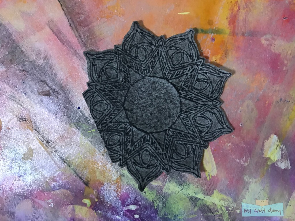
Close up of the details, it’s cut off on one side because I didn’t check the paper size before I cut and the design went off the page. I should have more of them but I can’t seem to find them..

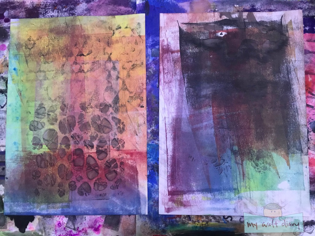
Remember my failed die-cutting session from Day 21-34 where the mandala/doily didn’t cut through all the way and I didn’t realise until I pull the paper off the cutting mat? They’ve been sitting on my table and generally annoying me since I didn’t know what to do with them. Somewhere in the middle of the die cut organisation session, I had a idea and tried it out immediately.

I wanted to keep the integrity of the mandala/doily, since my Silhouette did take a long time to ‘cut’ them and I thought that since the cut lines were etched into the paper, they would absorb water better, and I could bring out the design with watercolours. And voila, it did work and I’m so proud of myself. I wanted it to be dramatic, so I went with black watercolour and have to be careful with the amount of water as I didn’t want the whole paper to be soaking wet, just for the etched lines to absorb more of the paint naturally.

3. ‘Batman’ art journal page

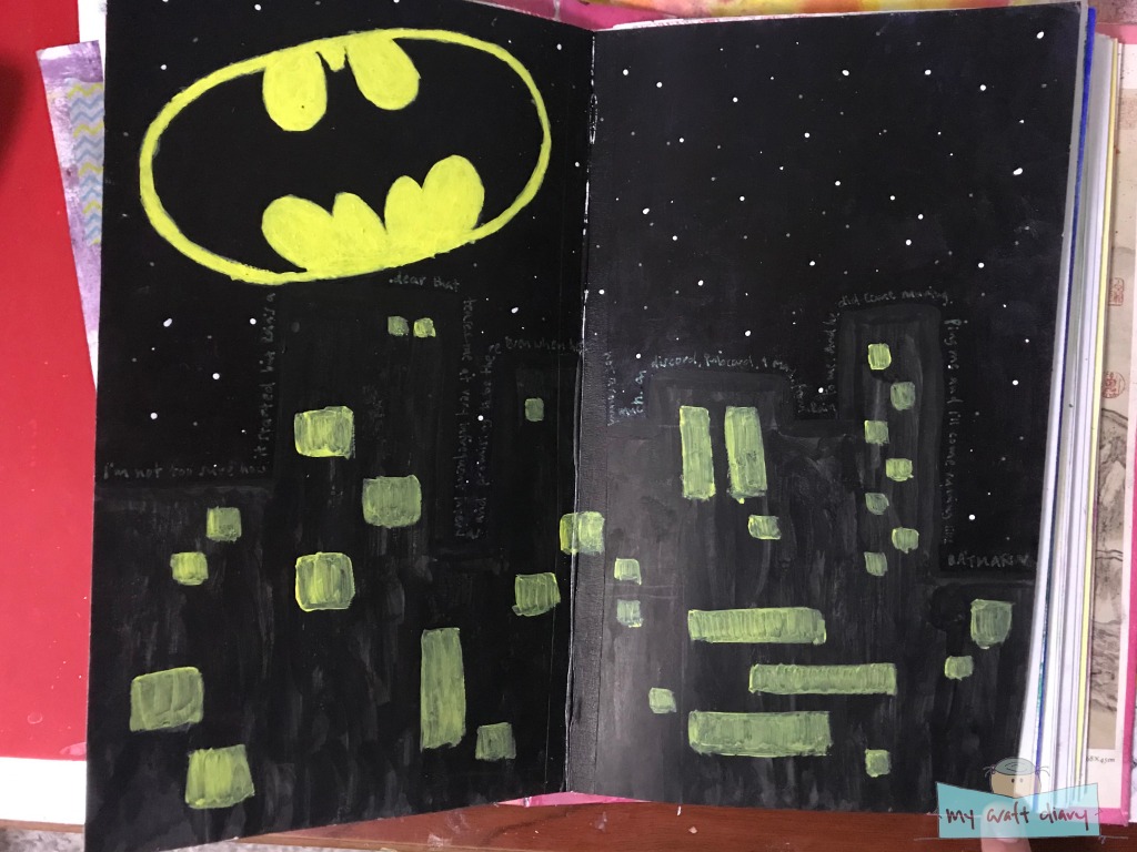
I had an image of this art journal page in my mind after an online friend mentioned that I just need to ping them (@ mention) and they’ll come running like batman. I started by making sketching out the skyline and then painted in the night sky using acrylic paint. I knew I wanted blue and purple tints to the sky so I mixed in some black to my paints. I actually liked how the colour turned out after mixing, but the paint layer was too splotchy for my liking, so I painted a second layer, which turned out way too black and the colour got a little lost. I could still see it if I tilt the page in the light but for the most part the night sky is black.

When presented a problem for my skyline, because I needed them to be black but still stand out from the sky. I tried with black chinese calligraphy ink and it worked out great, standing out from the ‘black’ of the night sky. The ink didn’t want to seep into the gesso-ed background much, so it’s slightly splotchy but I’m ok with the texture on the buildings.

I wanted the Batman beacon in the night sky, and I did a sketch on a piece of graph paper so that it would be symmetrical, before transferring to the page using tracing paper and painting in the negative image. It came out a little too large by proportions but I’m fairly happy with how it turned out, since I spent a lot of time layering on the yellow paint to be opaque. I used the same yellow paint for the city windows, but only single layer as I didn’t want to take the focal point away from the beacon. To finish up, I dotted the sky with starts and did my journaling using a Sakura Tiara pen along the edge of the city line.

I don’t think the page is perfect, but it’s pretty close to how I imagined it in my head and it’s meaningful to me. There’s a lot of paint layers on this page which doesn’t transmit through the photo but looking and touching the page in real life is pretty satisfying.

4. Journal pocket inserts

I can’t deny it, I have an attraction to junk journal because it involves so much paper, and I love paper. Though I have found that I don’t know what to do with junk journaling, I still really like to watch junk journal videos, and once in a (very long) while, I will make something which looks like I can utilise.

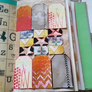
This project is one of them, a simple 3 pocket insert that I can stick into my Smashbook, which is sorely lacking pocket spaces for me to tug ephemeras in. It involved simple folding from a single sheet of paper, which I learnt from Treasure Books’ YouTube. This was the perfect opportunity to use the papers I tea-dyed a couple weeks back, since they have the aged look already. It took me just a few minutes to make 2 of them and they were pretty quick to embellish as well, though I kept it mostly flat and simple as I want them to sit in the pages of my other journals. Did you notice the mandala/doily which I made from (2) above?

I didn’t stitch them as I’m still not very confident about stitching on paper much, but I may do that afterwards as the double-sided tape doesn’t seem to want to stick too much.

4. Baby wipe distress ink technique

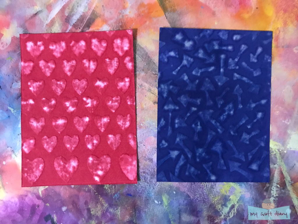
This is another technique that I saw on YouTube, this time from Jennifer McGuire on Distress Stencil Technique. In her video, she used distress inks, stencils, die-cutting machine and baby wipe to create a soft distress background and I was very intrigued by this technique. Unfortunately, I don’t own a die-cutting machine (no, the Silhouette don’t count in this case), so I have to be a little creative to try this technique myself.

To create an embossed look without a die-cutting machine, I used dry embossing with a stencil instead, placing the stencil and the paper faced down, and then use an embossing tool to emboss the pattern. Once I have the emboss ready, I place a baby wipe below and went over with the embossing tool again to take away some of the distress ink through the stencil pattern.

It.. didn’t quite turn out as I thought. Jennifer’s results were an even soft tone through the stencil patterns but I got really splotchy results due to the evenness of manual dry embossing. I think the paper probably played some role too as in some parts I completely lifted all the ink, like the distress ink didn’t get absorbs into the paper at all. I’m not too sure. It’s still a cool look though, and way more distressed than the Jennifer’s version. I should probably try this with other papers that I have but dry embossing is a tiring affair and I pretty much exhausted all my energy for the afternoon after these 2 cards. Oh well, next time then ;p

Well that’s all for the week! I’m still working on using my supplies, especially as I make more, particularly from my die-cutting adventures, instead of hoarding supplies. This seems like a problem I always have, especially as having more things can overwhelm me and paralyse me into inaction. And that wars with the practical side of me, because making something for the sake of making stresses me out equally, so I need a purpose for the making as well. To more crafting adventures ahead!

Day 19: #100daysofmycraftdiary

Took longer that I expected to share the next progress on my 100 Day Project but I have been sick in the last week and that really dampened my energy level. I do hope I still can recall what I did and my enthusiasms back then and capture them here.

So Day 19 was spent on an old incomplete project that has been sitting in my shelves for years. At some point in time, I made a bunch of recycled buttons out of cardboard. I don’t recall why, since I still have some that I previously made, but it’s probably could be that I wanted to use up some of those collected cardboard (I collected way more than I use them!). This is from an old Jennibellie tutorial, and there’s 2 parts to it – making the buttons, and decorating it. I made the buttons in a previous setting (years ago!), so today is all about decorating it.

I’ll admit, I didn’t follow Jenni’s tutorial to use ink pad for quick colour coverage since I had forgotten all about it, so used acrylic paint for all them instead. In my previous making of the buttons, I stuck with plain buttons with no decorations, so I wanted to try something different, pulling out some stencils and silkscreens for the decorations. Here’s a look at them after all the painting and decorating:

I quite love how they turned out, not sure why I left them as plain the previous time! I did leave the smaller buttons plain, as I didn’t want it to be too busy. Some things I learnt from the process:

  • Some patterns work better if they are printed partially. Some patterns work better if they are printed completely.
  • Colour is very important. Contrasting colours is a big no no, or at least I didn’t like how those come about. Audition colours before committing.
  • I love the look of a single focus image from the silkscreens – that’s the heart and star patterned ones. They’re my favourite!

Decorating all these buttons took up most of the afternoon, but there was still one last step to complete these buttons, which is to glaze them. Boy, if I thought decorating is hard, that’s nothing compared to glazing them! I used Glossy Accents for glazing as I like the glossy enameled look it gives my buttons. Jenni prefers Diamond Glaze, but I don’t like that because it’s too thin and the textured surface will show up. Glossy Accents bottles are a little finicky though, and they dry out the nozzle when I’m working over a period of time. My hand and neck were hurting by the time I’m done with my session, and that will still with half the buttons left to glaze! By then I was tired out and running low on Glossy Accents, so I had to order a new bottle.

Here’s look at the buttons after the Glossy Accents dried, I love how shiny they looks almost like real buttons. They’re great embellishments since they are pretty lightweight, and now I have a bunch of them ready to use!

Day 14-15: #100daysofmycraftdiary

The weeks past so quickly, and I find myself have such a backlog to document my 100 Day Project! Was busy over the weekend and hit by a strong crafty bug so I didn’t get a chance to blog about it. Instead of dumping the whole week of #100daysofmycraftdiary, I think I’m going to try to group them by days and share a little at a time. That way you don’t get information overload at one go, and I found myself itching to share more details on my projects rather than just listing out what I did.

Days 14 & 15 were fondly termed mixed-media days in my mind since it was full of mixed-media goodness. It all started with me watching this free mini-class about creating a tag journal from Christine Karpiak – it’s a 30 min class, but I’ll admit, I watched about 5 minutes of it before I was so inspired and rushed off to do some crafting on my own. (Don’t worry, I came back afterwards and watched the whole class!)

Day 14 is all about gelli printing! After the not so successful attempt 2 weeks back, I decided to try again and play with my gelli plate again, this time switching up the paints as I suspected the not so ideal prints the previous time is because of paints drying out too fast since I was using craft paints. I recalled that I was gifted with a set of printing inks a few years back and never really used them much, and printing inks should have long drying times so they would be perfect to try gelli printing with again.

And I wasn’t wrong! They print beautifully, and the colours were so rich. I pulled out a few stencils and mask to work with it, hoping to print some nice patterns. I didn’t have an idea of what I want to achieve but I knew I want to put down some fun colours and pattern and also try to layer them up for even more interesting patterns. Here’s how they turned out:

I did my prints on some cheap cardstock from my local store, and they took the paints pretty well. I have a 5×5 plate so they were much smaller than the papers, so I actually had to build up a lot of layers. If I were to try this again, I think I would cut down my papers so that it is closer to my plate size. Having to print on such large papers with a small plate resulted in some harsh edges, and some parts of the pages get more overprinted than others, while the edges especially gets underprinted. I don’t think they are great prints, but I had lots of fun all the same and I did try to print them with some purpose. But I’m sure with more practice I will get better at this!

To add even more colour and interest, I took pastel sticks and layered on some colouring and marks to bring out some of the printed patterns. As bonus from the printing, I also have 2 pages of paint paper that I used to roll off the excess paint from my brayer. Colour blend backgrounds are my weakness so I tend to stop myself from layering more. I do hope that gelli printing will make me more daring to just do more with layering and I can learn to appreciate ‘More is more’!

Scrap papers from rolling off extra paint from brayer

Day 15 came as I was packing up the supplies from the my gelli printing since I left them out to dry. My printing supplies are kept at the bottom of my shelves so I had to put it back first before everything else that is stored on top of it, which is all my paint and colouring supplies. I had a thought that I haven’t played with my Inktense blocks for a while, and I was still on a roll with making coloured backgrounds so I decided to play with my favourite Inktense block technique – scribble on some colours and blend them with baby wipes!

Inktense block background

I love using baby wipes to activate water-soluble colours, especially on watercolour pencils and Inktense block. The moment when you likely swipe at the colours and they turn to ink and blend together, I don’t get tired of that joy! I picked somewhat contrasting colours of yellow, orange and purple, but they actually worked very well together. I tried not to overblend too much as I was afraid of making mud and I think they turn out pretty well. To layer up more texture, I took a wet paintbrush to my Inktense blocks and painted over with the same colour a little, and then I did paint splatters on top of them. The paint splatters were so fun, especially when they landed on their adjacent colours. The yellow on purple is my favourite, popping off the page and making me so happy to look at them.

It’s been a while since I just played and make backgrounds just for the sake of making backgrounds and I had so much fun these two days. And I think it shows in the blog posts with the number of exclamation marks I used haha. Hope you enjoy this little feast of colours from mixed-media!

(Note: I’m typing this from my laptop today and tried my hands at adding some watermark on my images again. Feels a little big on the images I think?)

November’s Instagram 2015

Here’s another sharing of my monthly craft related instagram posts! I didn’t do any sharing on for the months of September and October because there wasn’t any to share, or I ended up sharing the photos on the blog. You can find the previous instagram sharing here.

IMG_20151101_222532
A small stamp carved out of a flag eraser. Was feeling restless so just did something randomly without any planning and ended up with a wonky grid design. I printed the stamp onto my art journal as an all over pattern to see how it looks, as inspired by Julie Fei-Fan Balzer.

https://www.instagram.com/p/91Jug0xWo9/

I seemed to have lost the original photo for the above post from my phone, so putting in an embedded photo from Instagram. This was a whimsical art piece, inspired by one of Jennibellie’s old videos, whose image was floating in my mind for the longest time. I stamped the “hair” using a round found object, then sketched in the face with colour pencils and randomly filled the hair circles with colour. The funny thing about this happened the next day when I looked at it, and I realised that the colours I picked for the hair was almost exactly the colours of the Tsum Tsum game title screen, and that the face strongly reminds me of buddha. Odd combination, but this sudden realisation made the work more significant for me.

IMG_20151111_135733
This is an art journal page insert made from a TCW + Balzer designs stencil called “Funky Tags”. I stenciled the shapes onto some painted patterned paper, cut them out and then arrange them in this pattern. This was a result of me getting excited that TCW followed me on Instagram, and Julie Fei-Fan Balzer herself commented on my previous flag eraser stamp post. I am also proud to say that this photo is also featured on Julie’s monthly newsletter from her blog Balzer designs. Such a pleasant surprise!

That’s all for last month’s instagram photos! That’s quite a lot considering the 2 weeks of deadlines and preparations of exams in school. I guess that’s also why I share more because each completed work is something I really like when I specially take the time out to work on them or when they are much needed break from everything else. Thanks for stopping by!